Wednesday, September 30, 2009

Children's book illustration


This is from a submission I did awhile back for a publishing company here in New Zealand.
I've since been developing more concepts aimed at the children's market.
I enjoyed doing the model sheet (far right image) as it helps keep a consistency with the character.

Tools used were Photoshop CS3.

Any thoughts or comments are most welcome!!

Friday, September 25, 2009

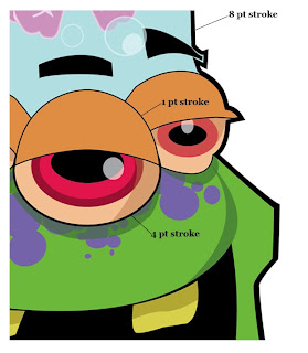
Vector cartoon: Inking Control

Love using illustrator CS for the inking stage. Illustrator gives you greater control for adjusting thickness of line and also maintaining the stroke weight through out the image.
For the little alien dude I mostly used 1 pt stroke and to give the image a bit of punch I used a thick 8 pt stroke for the exterior outline.

I have often used Illustrator to do up the inking stage and then export or save out to Photoshop where I can then colour up to my little heart's content. It can be labour intensive using illustrator but the pay-off is having the yummy crisp even stroke.

For a further look into vector inking check out this tutorial From Sketch to Vector Illustration.


Monday, September 21, 2009

Cartoon Animation


A fun recent collaboration with Raymond at Red 5. Raymond did all the animated effects (Please check out his site) he has some awesome stuff.

I supplied all the digital artwork (Illustrator files).
For me it was a great learning curve coming up with storyboards and the refining process to get the characters looking just right.

There will be a future post in which I'll show images used for the animation and some things I learned along the way.

Thursday, September 17, 2009

Photoshop Caricature

This is my brother-Law Mark.
Always the challenge to try and capture the spirit of your subject and not just rely on drawing a big head little body.
Tools used were my brain (ouch), a few A4 sheets and Photoshop CS3.
I'm currently using a technique that works well with a optical mouse....yes I'm one of those people. I lay down flats (a comic technique) then shade in again over that base flat colour.

Thursday, September 10, 2009

In the Forest: exercise of Composition


This is a image I did awhile ago for my lovely wife.

It was a great exercise to learn how to best use the background & foreground elements to produce a pleasing composition.

I used the left top tree and bottom right area to frame the characters.
Also using the path from the castle to flow downwards helps to draw attention to the main characters.

Friday, September 4, 2009

First Post: Welcome!!


Hello and welcome to my first post.
Who am I about and what do I want? Well -
I'm a freelance illustrator hoping to better myself everyday in my craft.

My hope is that this blog will become a place to grow and connect with others whom are passionate for character illustrations.

The above image is a submission I did for a t/shirt competition recently.
Though I wasn't successful, I really loved coming up with the idea.